Seshen is a modern event ticketing platform built specifically for play-based activities — sports, hobbies, workshops, and social experiences. Unlike general-purpose platforms, Seshen’s mission is to make discovering and joining activities effortless, intuitive, and visually inspiring.
The product was born from Ahmad’s real-world frustration after moving to Manchester and struggling to find reliable, centralised listings for his favourite activities. Instead of a simple discovery experience, the process involved hours of searching across scattered websites, outdated social media pages, broken organiser sites, and even phone calls. Seshen set out to eliminate all of that friction.
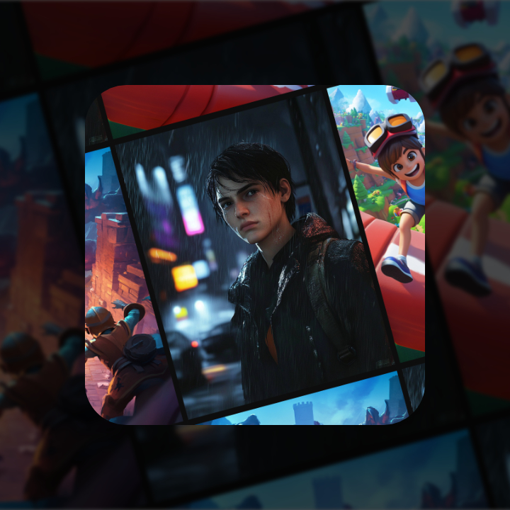
Design became the core differentiator from the start. The platform adopted a bold urban aesthetic and an image-first experience inspired by Airbnb’s focus on emotional resonance and visual immersion. Every interaction, layout, and component was designed to feel modern, trustworthy, and activity-centric — giving users the sense that discovering activities should feel as exciting as booking a holiday.
The design process for Seshen was grounded in competitor analysis, user empathy, and high-fidelity interface exploration across both desktop and mobile. We reverse-engineered the design philosophies of Eventbrite, Meetup, and Airbnb — identifying where they excel and where they fail users looking for play-based activities.
Our design direction was built around three pillars:
The result is a feeling of clarity, speed, and trust — a platform designed to remove friction and guide users directly to experiences they care about.
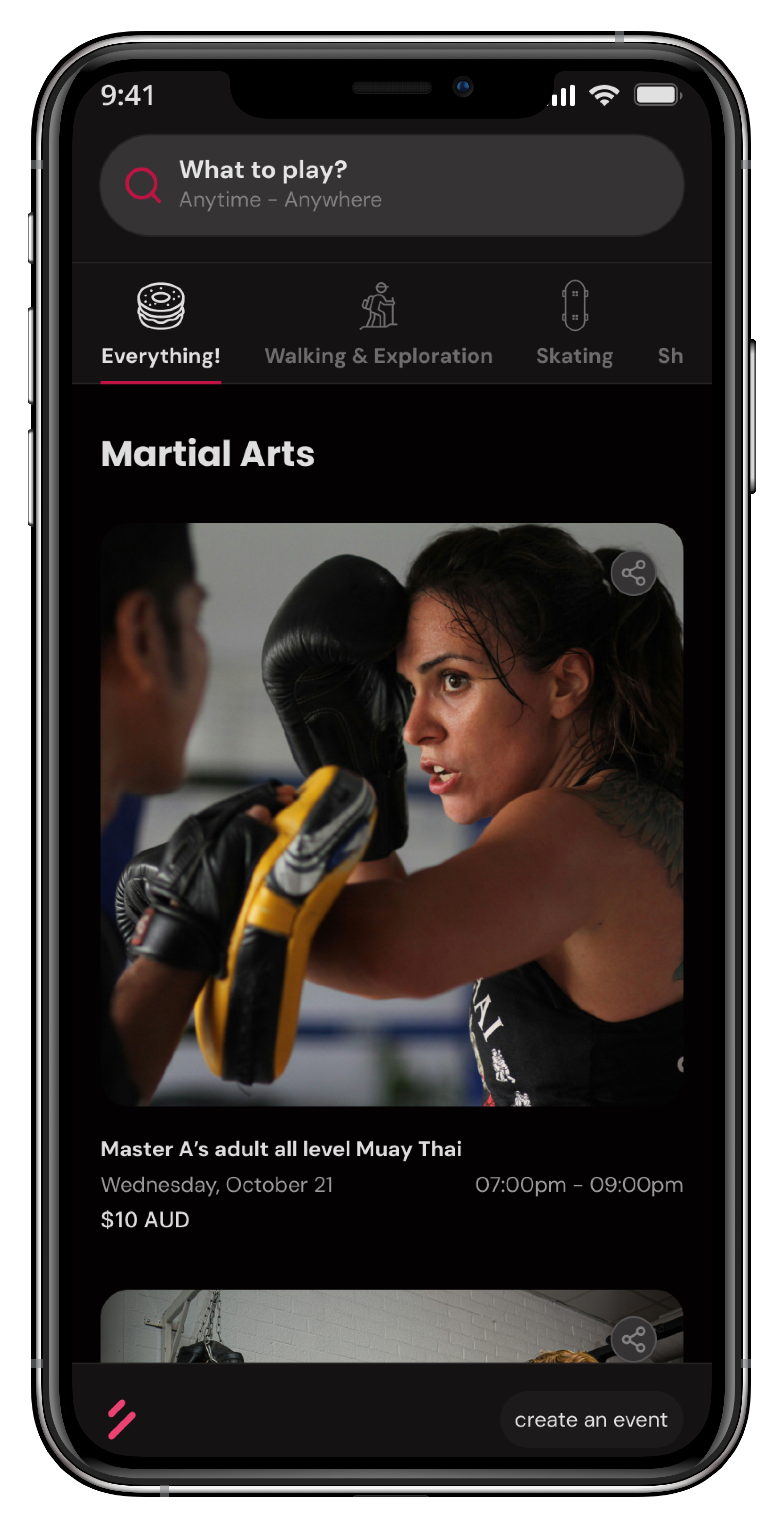
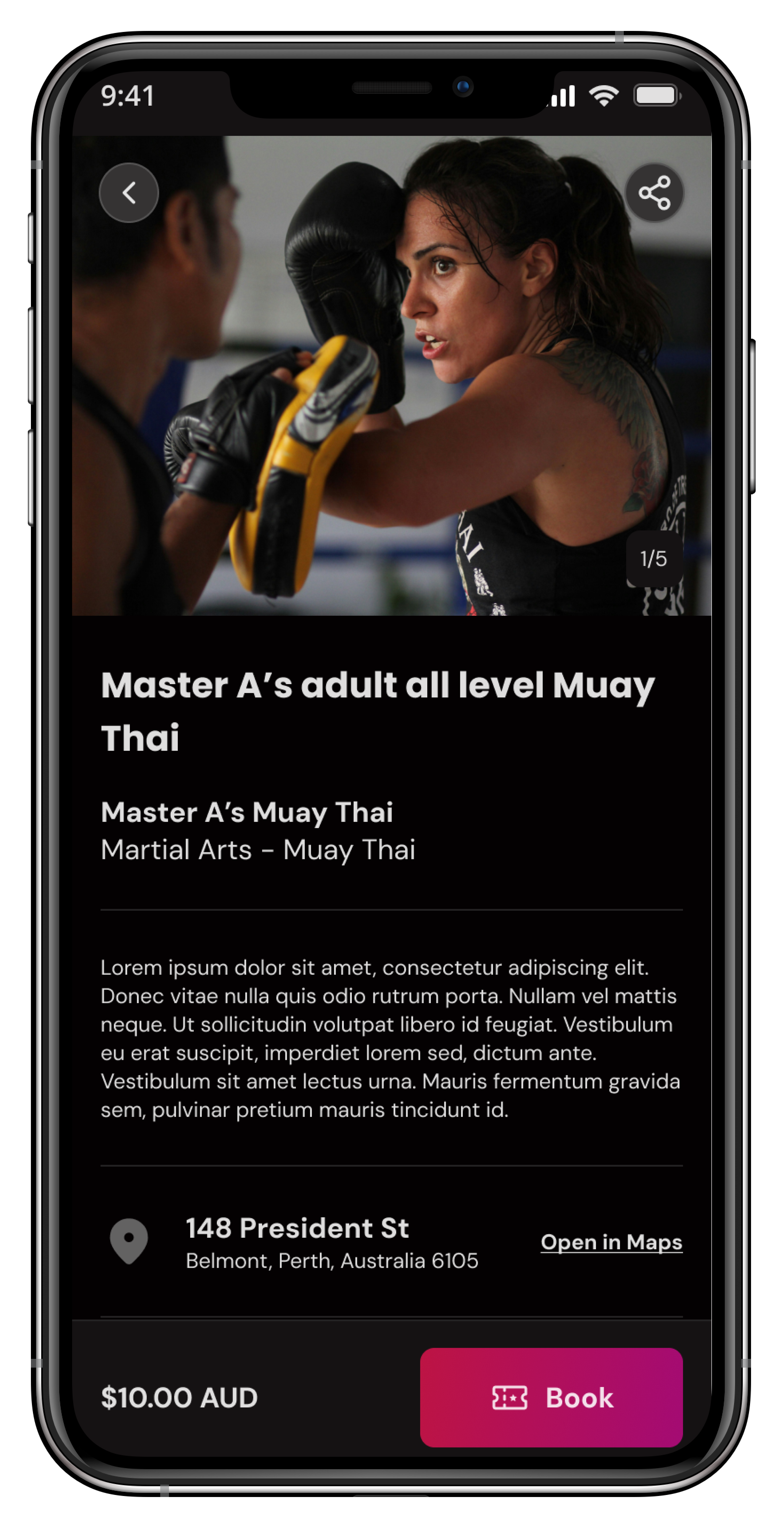
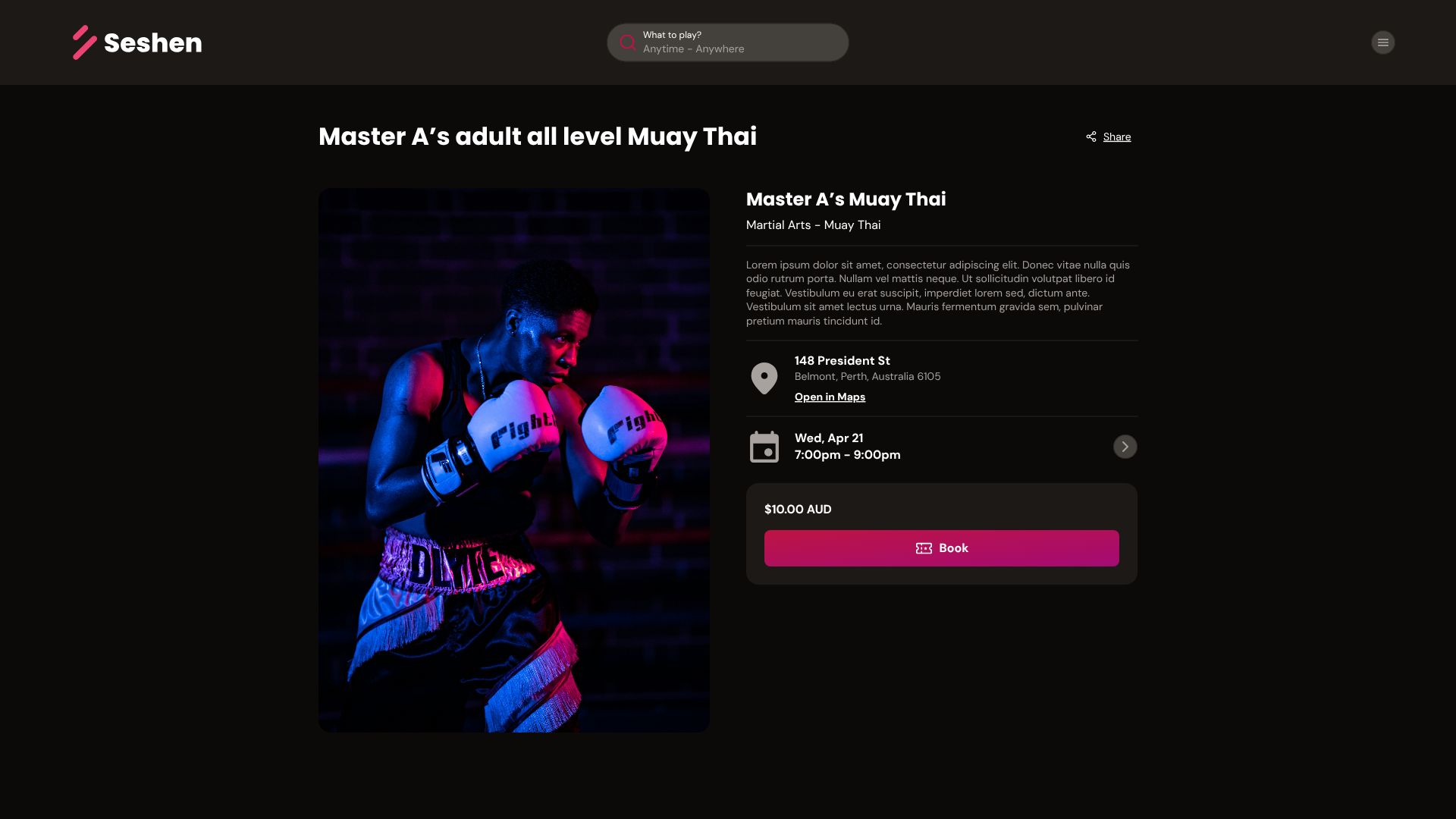
Experience-Led Listing Cards
Activities are easier to evaluate visually, so we built cards where images lead the content.
Title, location, date, and price sit beneath the visual anchor, mirroring Airbnb’s high-trust browsing flow.
Clean, Mobile-First Navigation
Most users search for activities on the go, so layouts were optimized first for mobile gestures, spacing, and hit-targets.
Urban & Modern Brand Identity
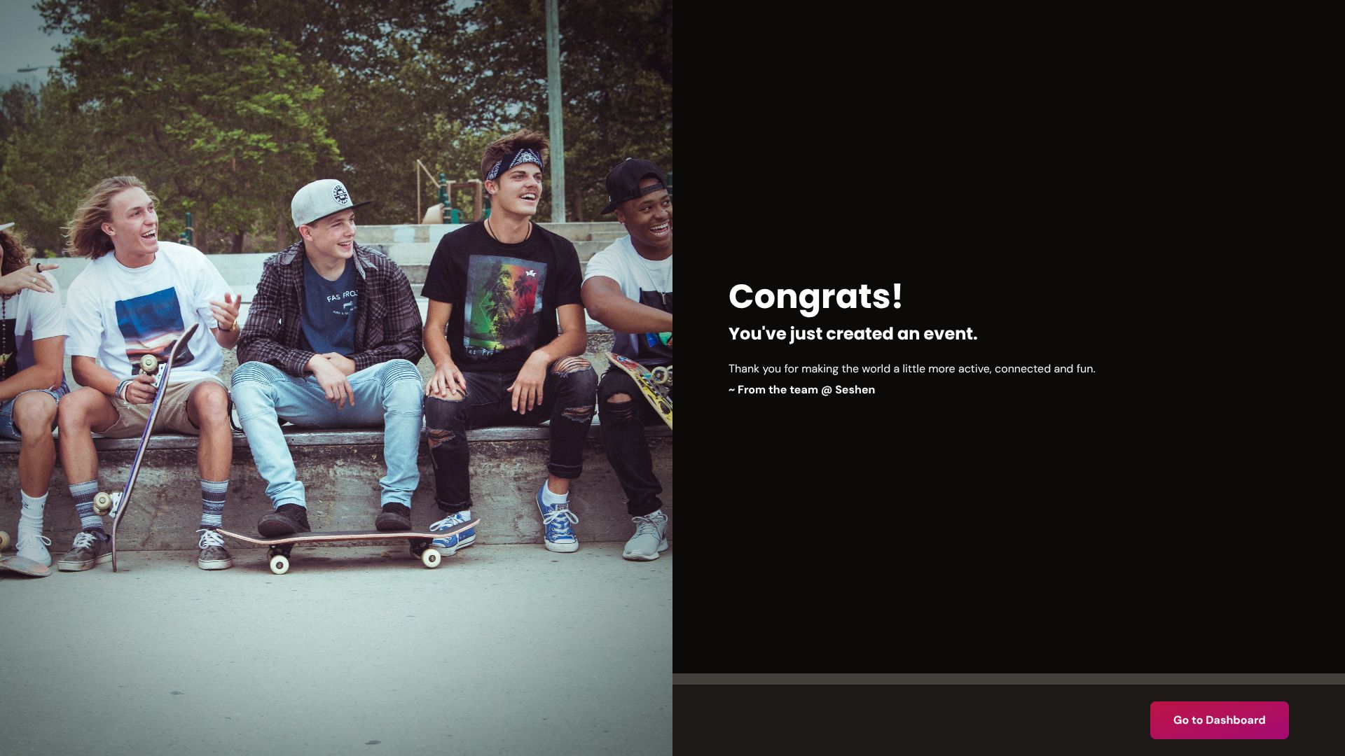
A dark theme with vibrant accent colours, crisp typography, and a grid-driven layout establishes Seshen as bold, confident, and contemporary.
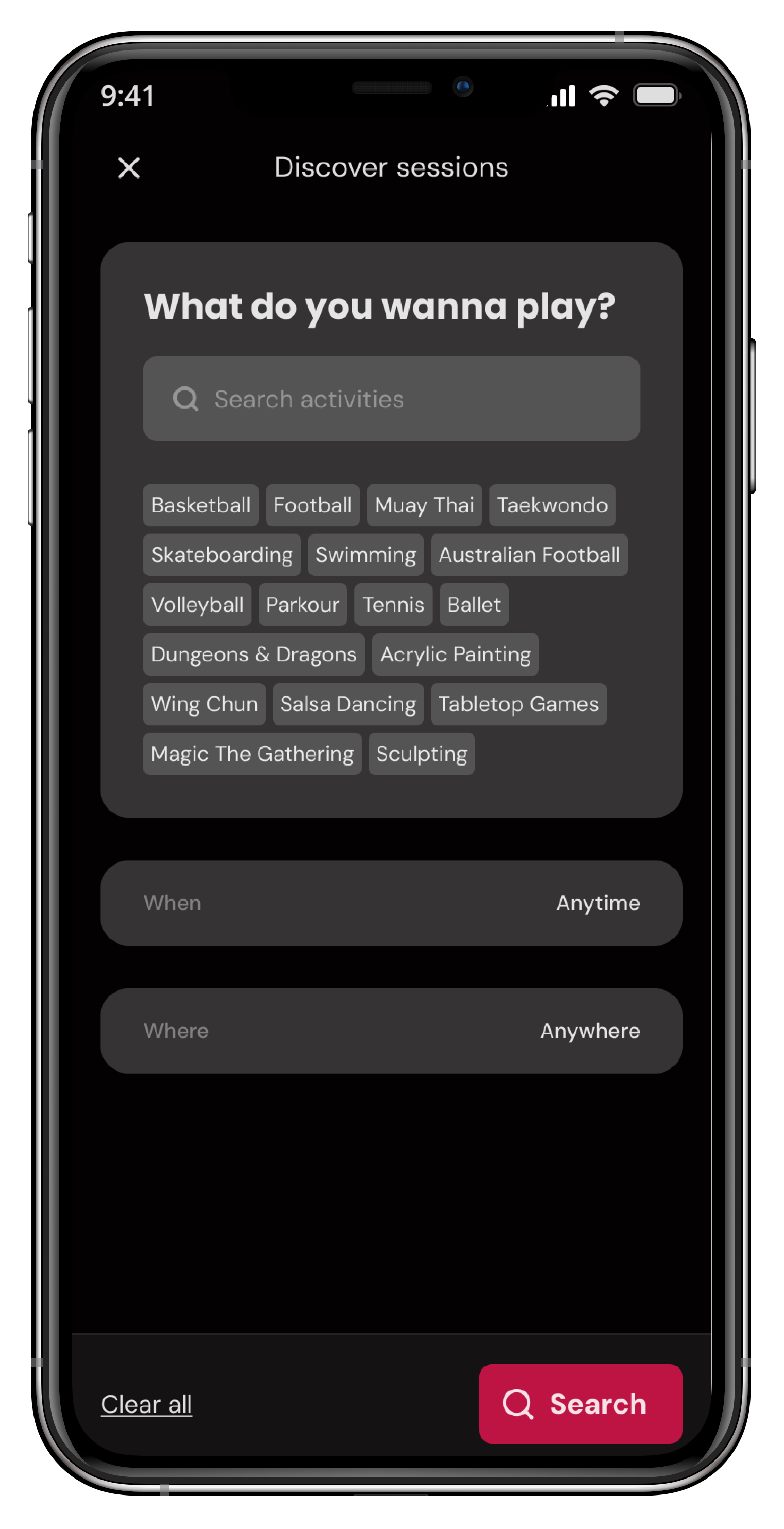
Simple, Fast Discovery
A refined filtering & category system helps users jump directly to the type of activities they care about — removing the “scrolling fatigue” found in Eventbrite and Meetup.
A Full Design System
Built around tokens, semantic colour names, consistent spacing, and atomic components.
This ensured rapid iteration during prototyping and provided a scalable foundation for future development.
Fragmented Discovery Experience
Users previously needed to search across multiple platforms just to find available events.
Solution: Create an aggregated, visually-driven marketplace focused solely on play-based activities, with clean filters and intuitive sorting.
Standing Apart From Generic Event Platforms
Most event sites feel cluttered and lean too heavily on text.
Solution: An image-first design that emphasises photography, moments, and experiences — giving Seshen an emotional edge similar to Airbnb.
Balancing Urban Identity With Usability
Dark, bold interfaces can easily become visually heavy.
Solution: We used bright accents, whitespace pockets, and strict typographic hierarchy to maintain clarity and visual rhythm.
Building A Future-Proof Visual Language
Without a strong design system, iteration becomes slow and inconsistent.
Solution: Develop a complete design system with tokens, components, variants, and atomic patterns, ensuring Seshen could grow confidently.